Brilliance Revealed, Legend Delivered
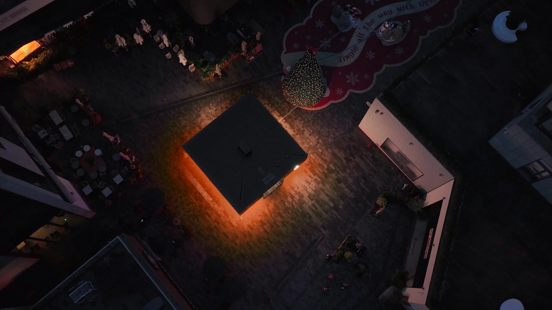
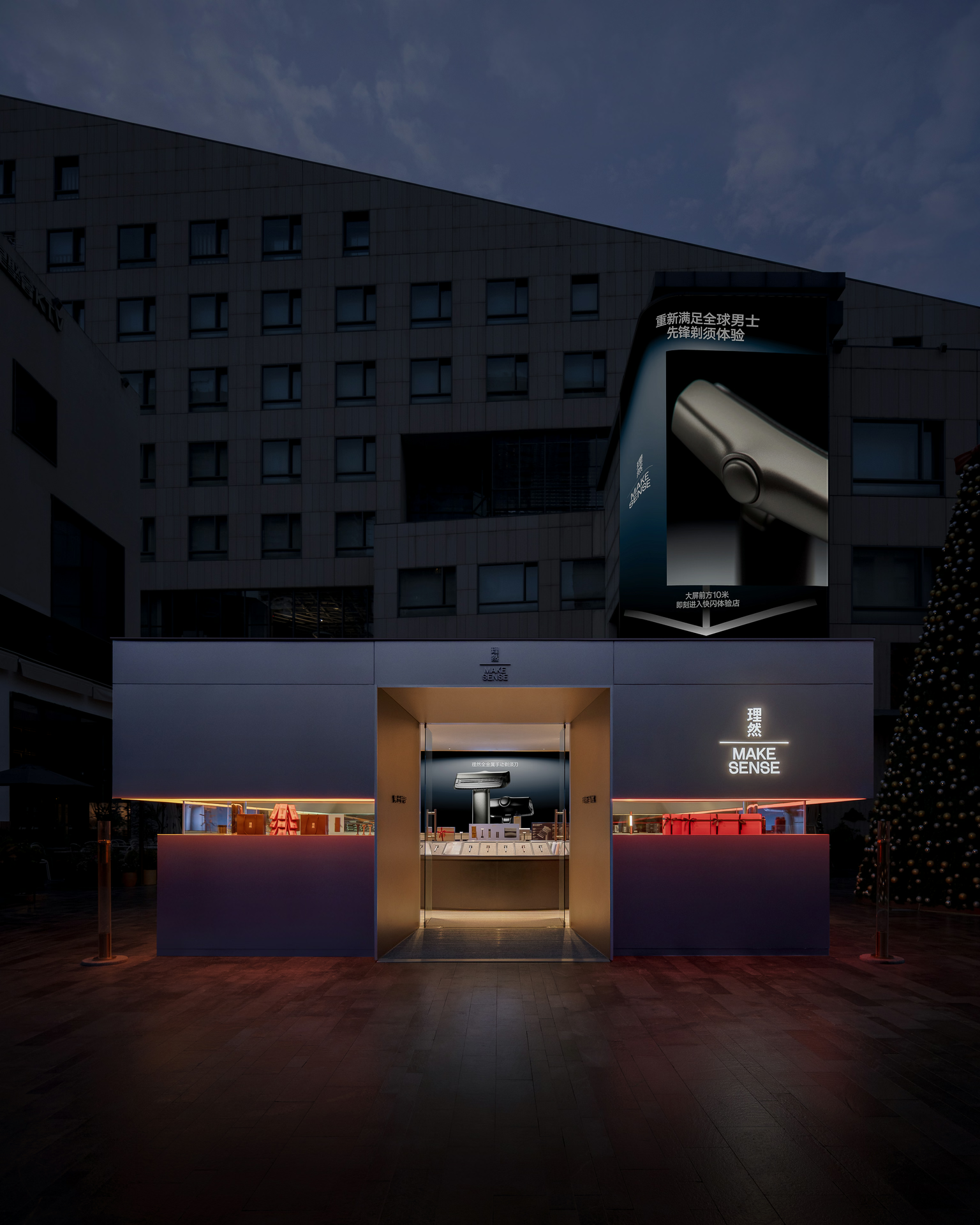
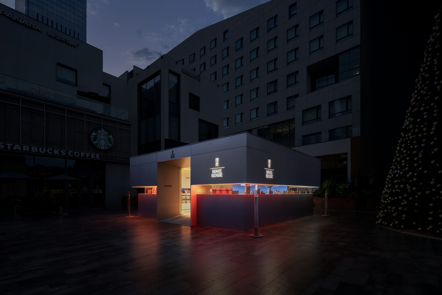
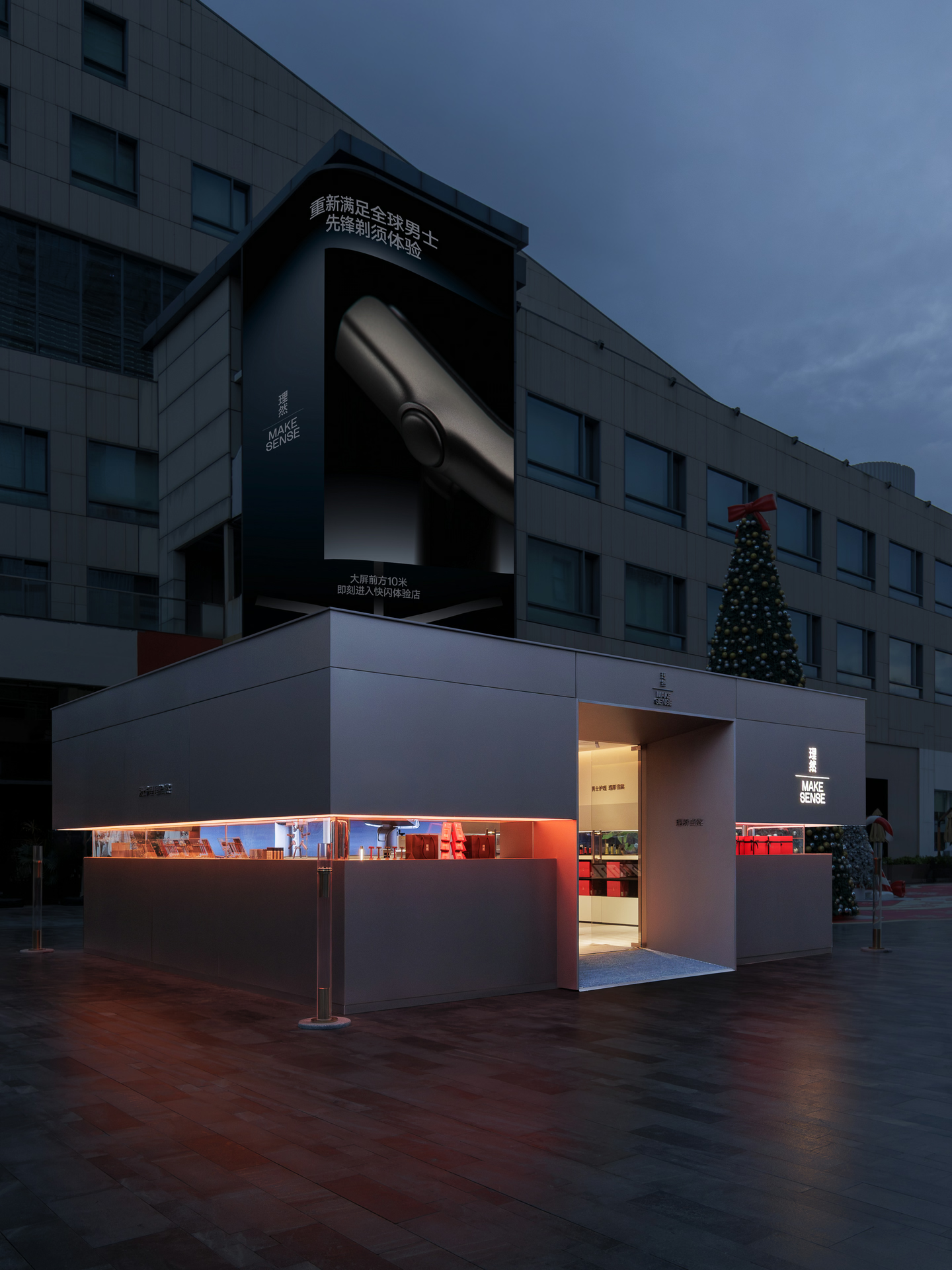
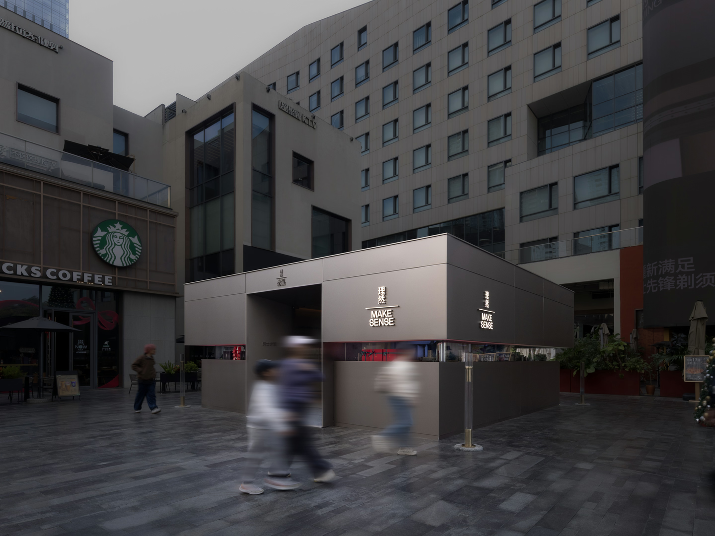
As the Christmas season began, Make Sense set up a limited-time "Dark Gold Gift Box" pop-up amid the bustle of the city, where rational design meets festive warmth. Together with E Studio, the brand created a new in-store experience for the launch of its latest razor.
Founded in 2019, Make Sense is a contemporary men's personal-care brand. It studies how men's skin differs, what causes common problems and how science can address them, and offers precise, effective care across skincare, grooming, body care, fragrance and shaving, setting a new professional standard for men's grooming.
Chapter 1 · Visual Reconstruction
The heart of the design lies in translating the brand's essence into tangible space.
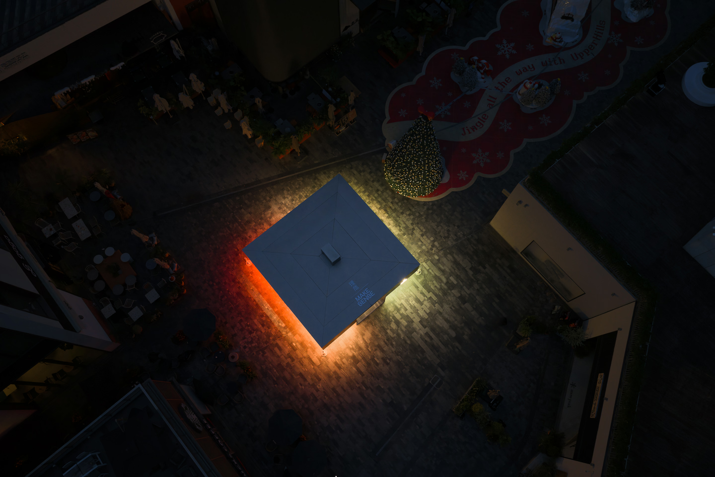
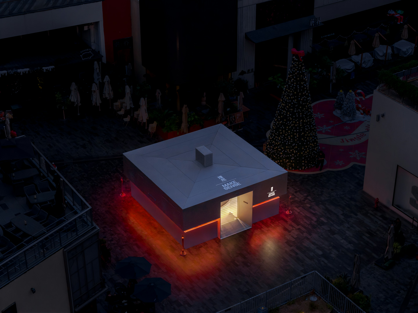
Make Sense's DNA is sincerity, decency and a pioneering spirit, and it sets out to reshape the visual language of men's grooming. For the launch of its one-piece metal razor and the Christmas gifting season, E Studio adopted "Geometric Vision" as its design language, turning the product's rational logic into a space you can feel.
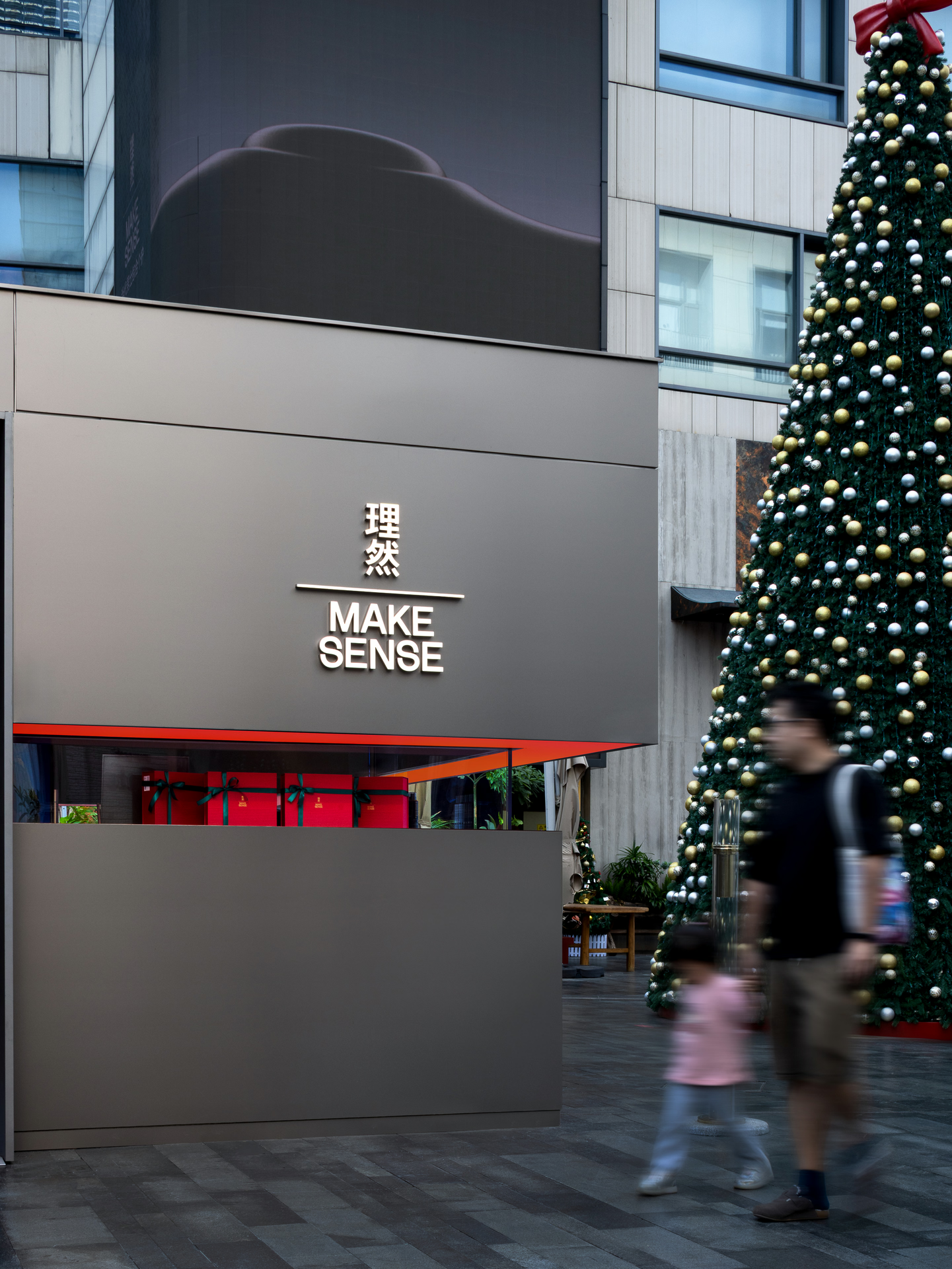
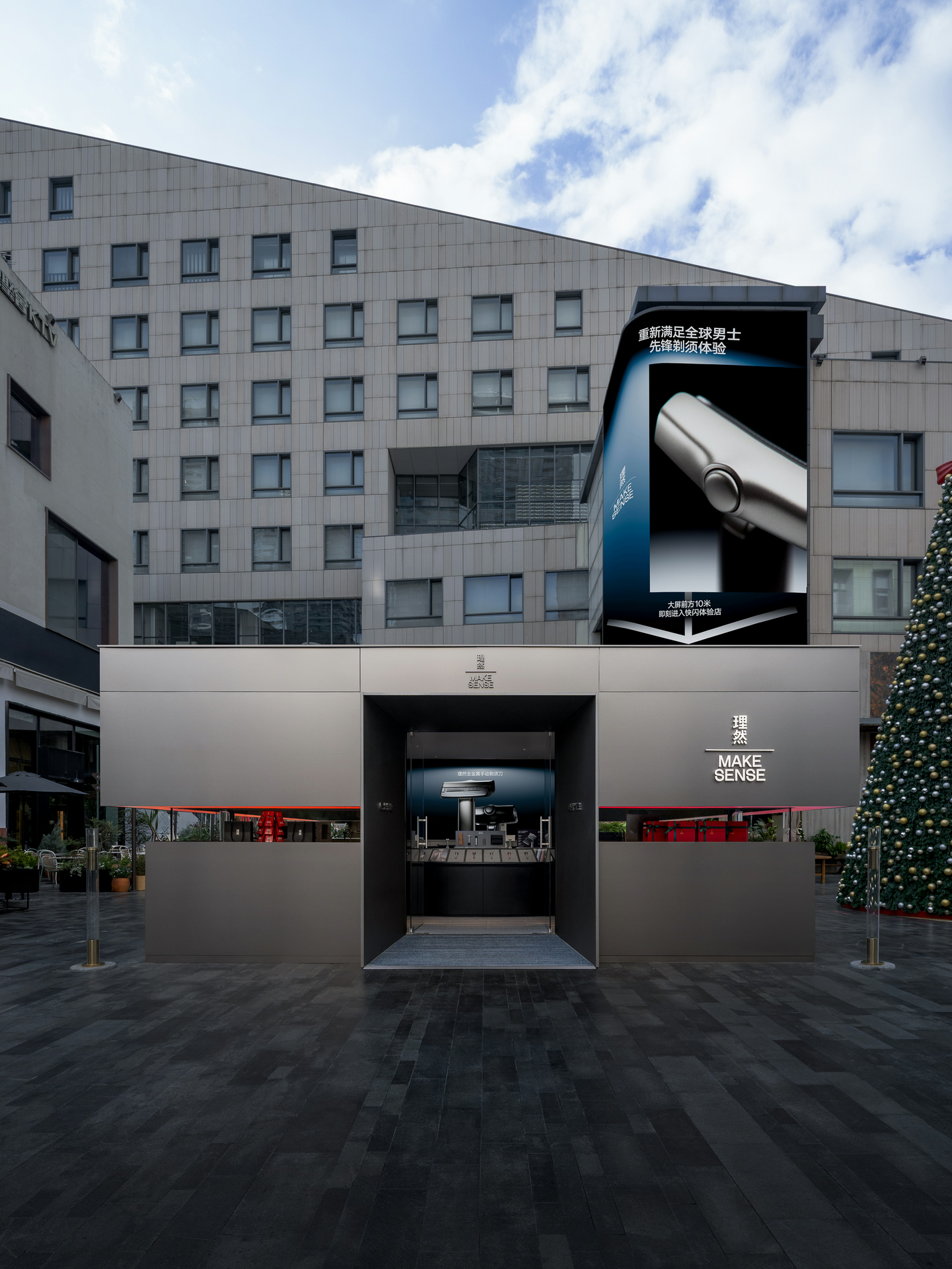
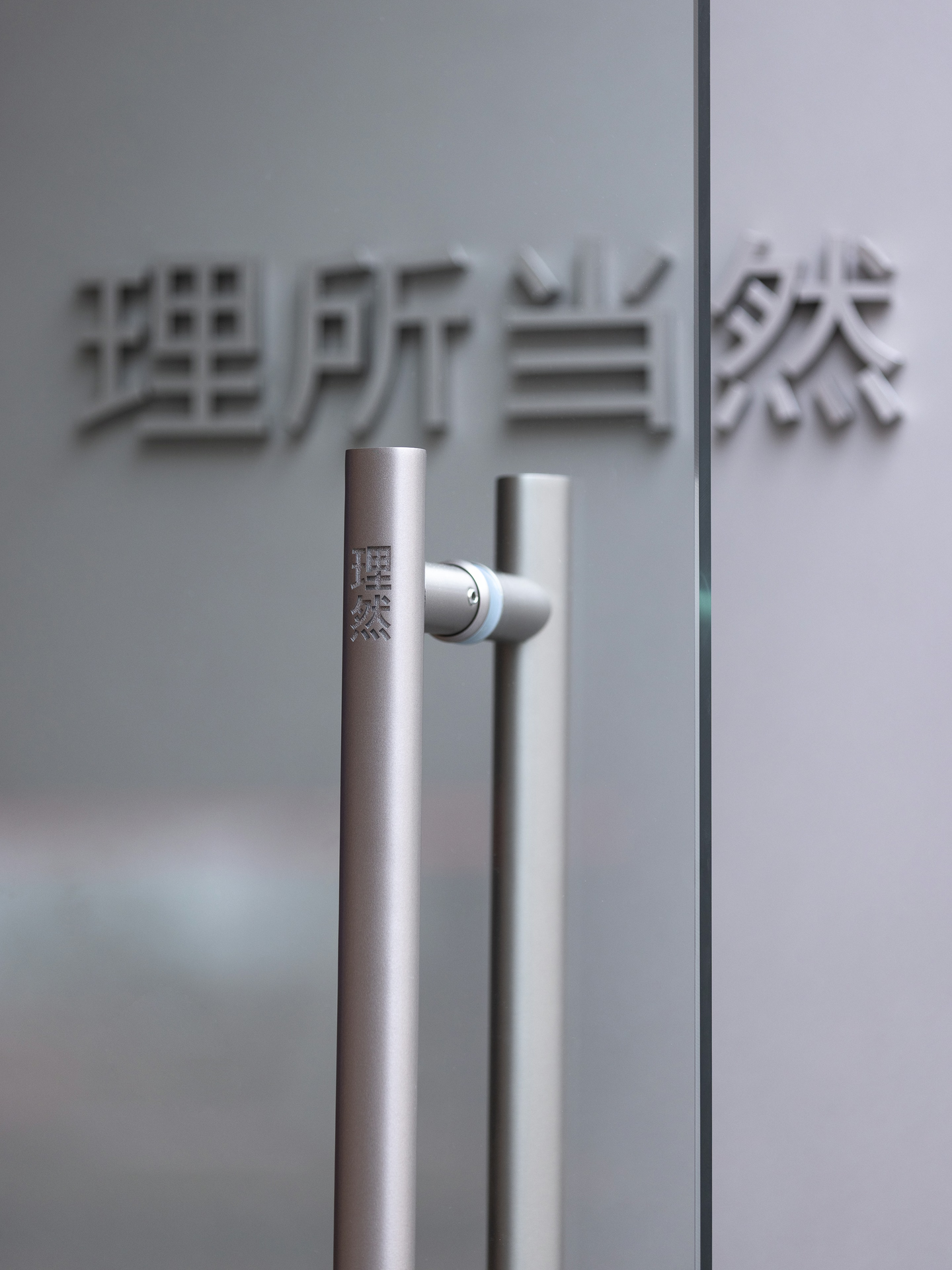
The design goes beyond building a physical space: it takes apart the brand's graphic language. The geometric lines and generous white space of its visual identity become the structural modules of the space, lifting two-dimensional graphics into three dimensions so that the brand's typographic aesthetic carries through to the cuts of the façade and the display system: a seamless step from visual identity (VI) to spatial identity (SI).
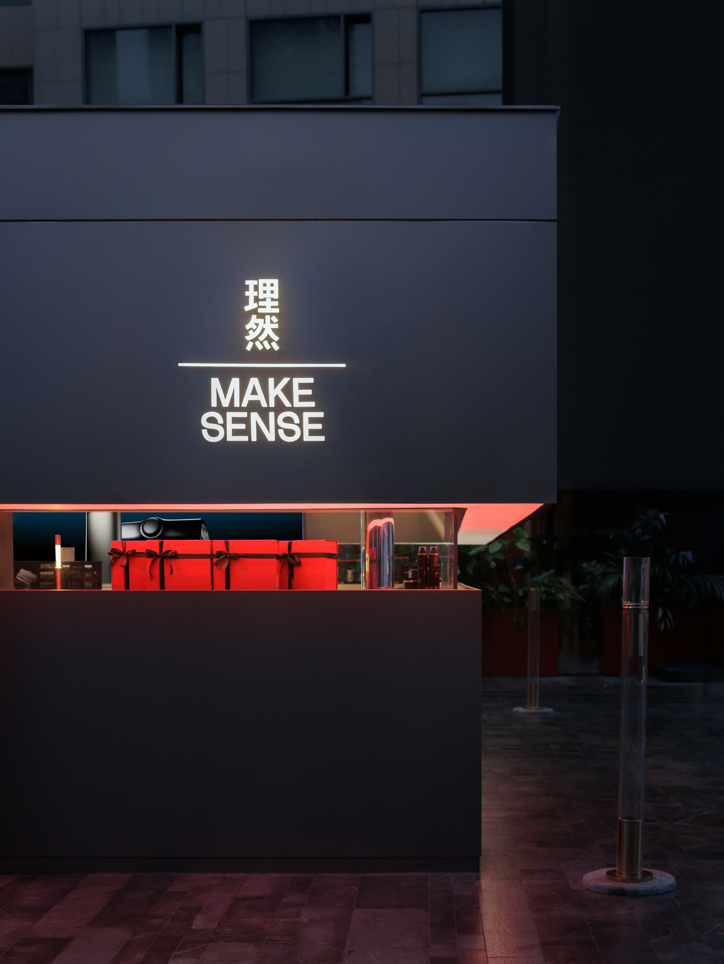
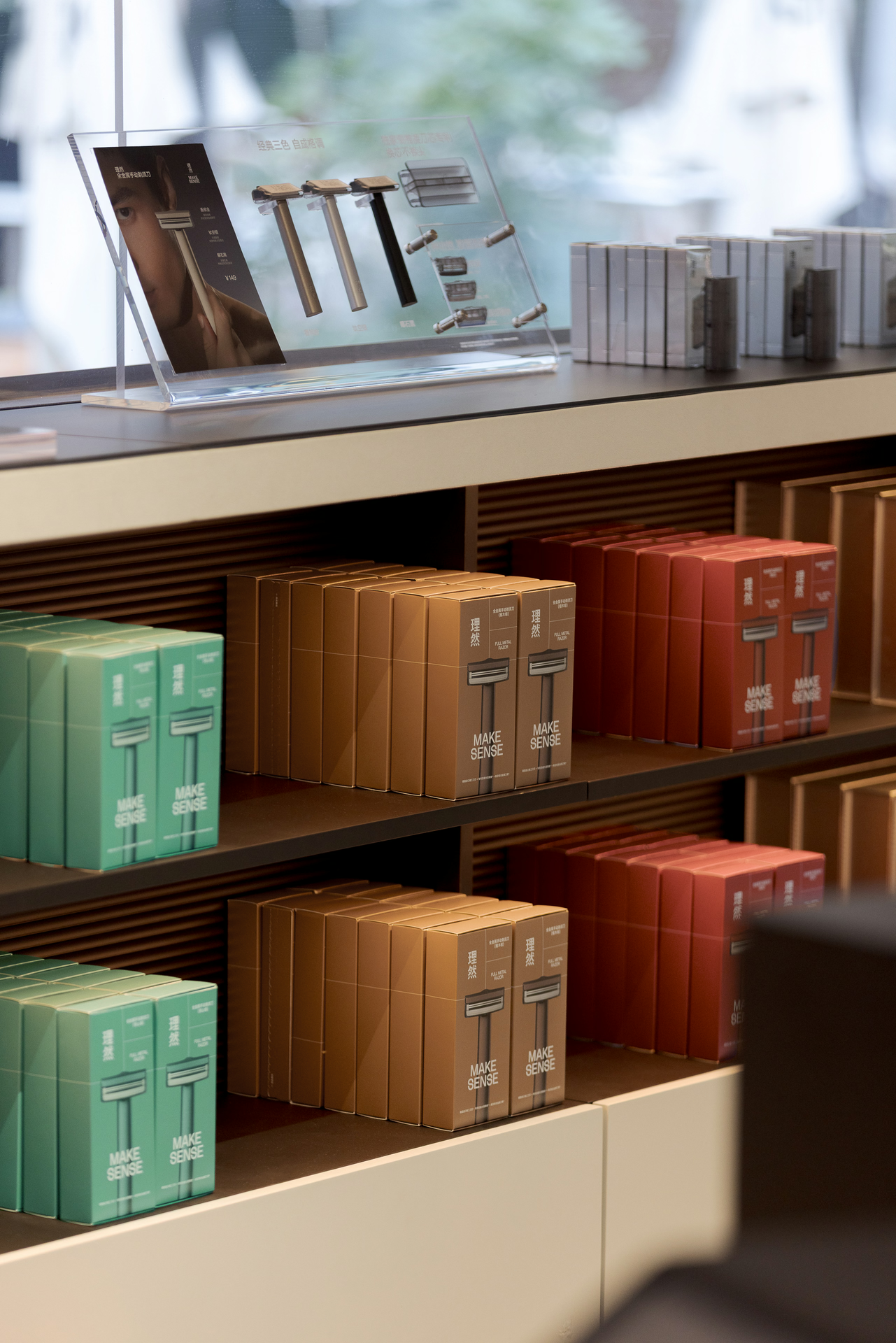
Avoiding decorative excess, the space uses "restrained refinement" to balance geometry across function, display and emotional connection. The product's dark gold sets the base colour, with Christmas-red light added as an accent, poised between festive warmth and minimal tech aesthetics. By planning and guiding how visitors look, the space captures the moment a gift box is opened.
Chapter 2 · Order & Light
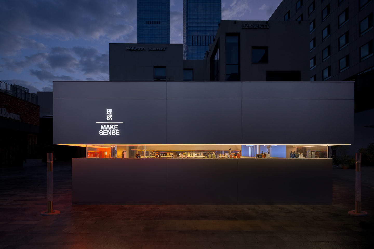
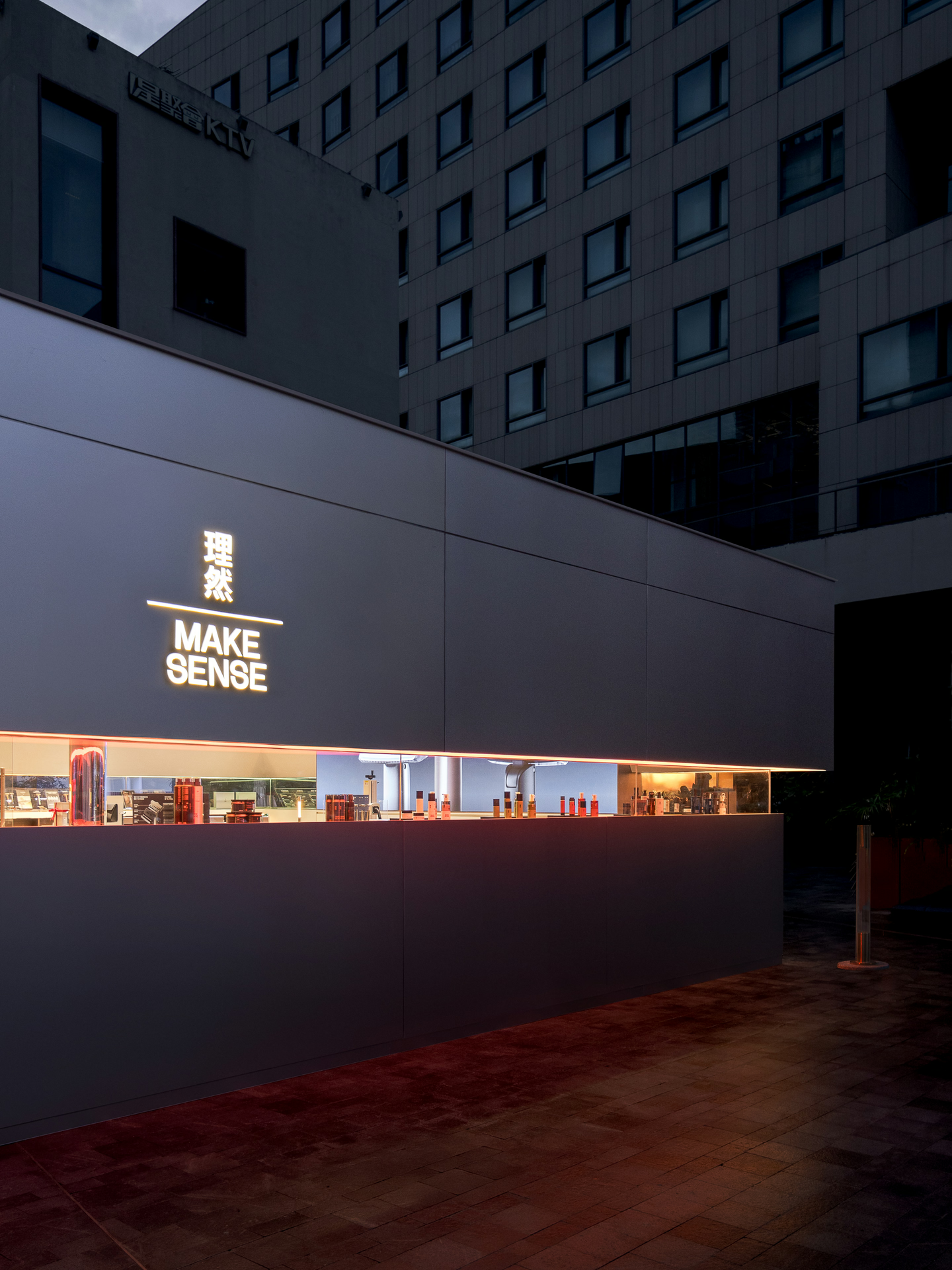
Light is the medium that draws a clear boundary in a busy city block. A crisp linear window echoes the edge of a razor blade, giving the façade order through precise incisions. As people step into the sensor zone, the lights come on from the inside out, and a diffuse warm-gold glow softens the chill of the metal, blending rational aesthetics with festive warmth.
The proportions and positions of the window cuts follow the grid of the brand's graphic design, turning the storefront into a three-dimensional brand poster.
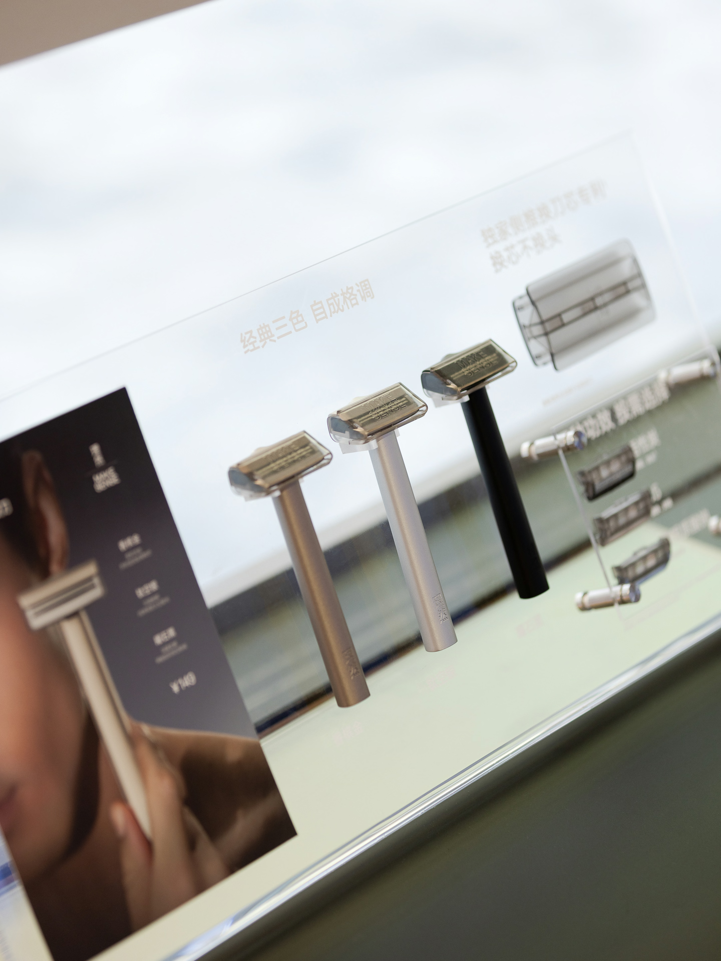
By breaking down and rebuilding the geometric field, the space gains a simple logic and order. Guided sightlines fix passers-by's eyes on the hero product, and this framed "vision" weaves the flow of people outside and the displays inside into a festive scene that tells a story: clear, modern and richly layered.
Chapter 3 · The Unboxing
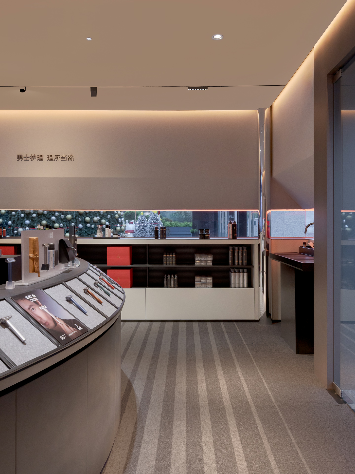
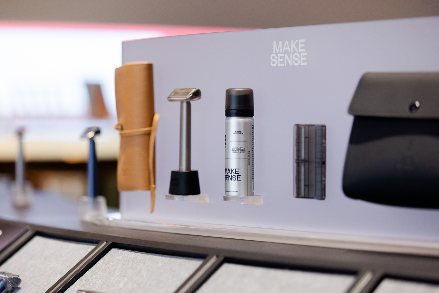
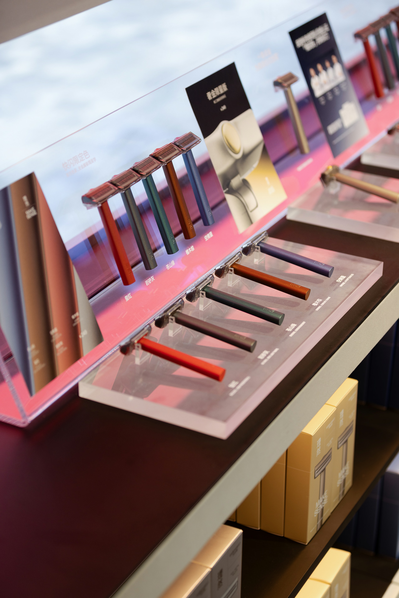
If the cut of the façade is where the visual story begins, the interior layout extends the act of unboxing. E Studio laid out a complete interactive path, so that moving through the space feels like gently opening a gift. From large volumes to the smallest signage, the graphic logic holds throughout, keeping the brand's message precise.
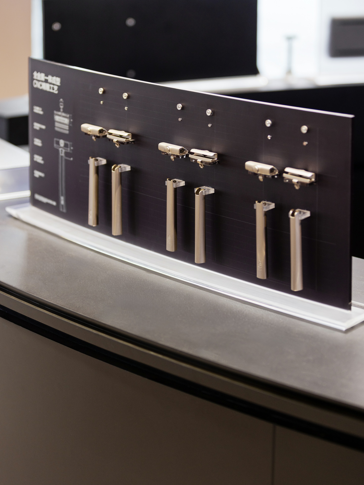
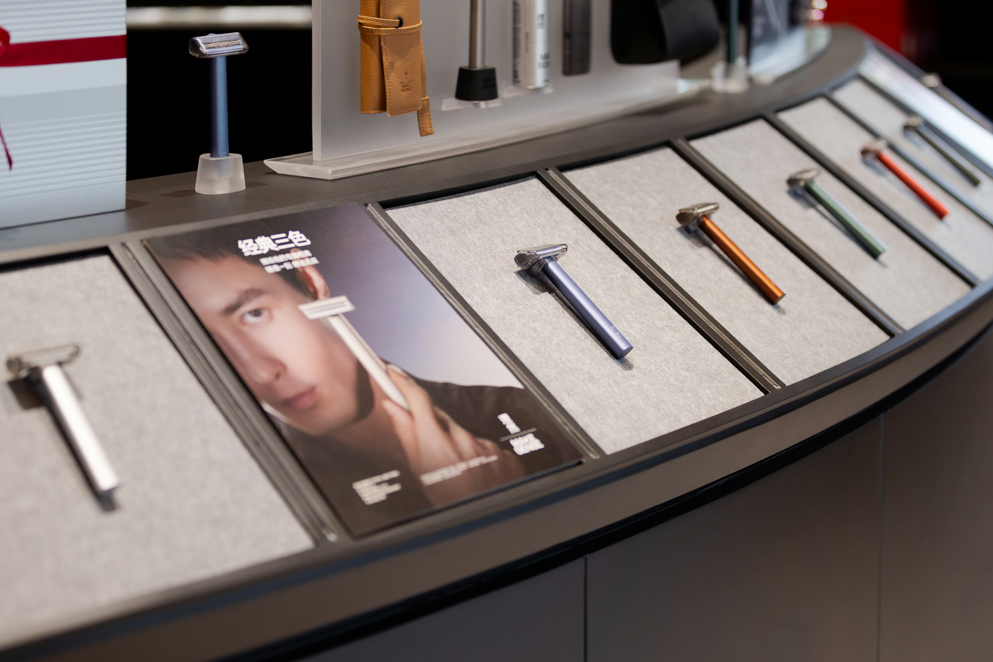
The new razor is no longer an isolated display, but sits within a series of narrative modules made of metal and light. Through contrasting textures and carefully controlled lighting, the design leads visitors from noticing the product's physical qualities to imagining it as a gift. This functional layout turns the brand's abstract value of decency into an experience you can touch and anticipate.

Chapter 4 · Essence & Spirit
Good design lets a brand's spirit be felt without words. Guided by a balance of minimalism and technology, the space interprets Make Sense's core values of sincerity, decency and pioneering spirit with restraint.
Sincerity: shedding decorative marketing, the design returns the story to the product itself, using pure display logic to recall the brand's original commitment to men's care.
Decency: rigorous geometric order and contrasting material textures echo a restrained, rational way of life, creating an experience with a sense of ritual and the right sense of scale.
Pioneer: combining a minimal setting with interactive, sensor-driven light, the design reshapes what a men's personal-care space looks like and sets the brand apart in its field.
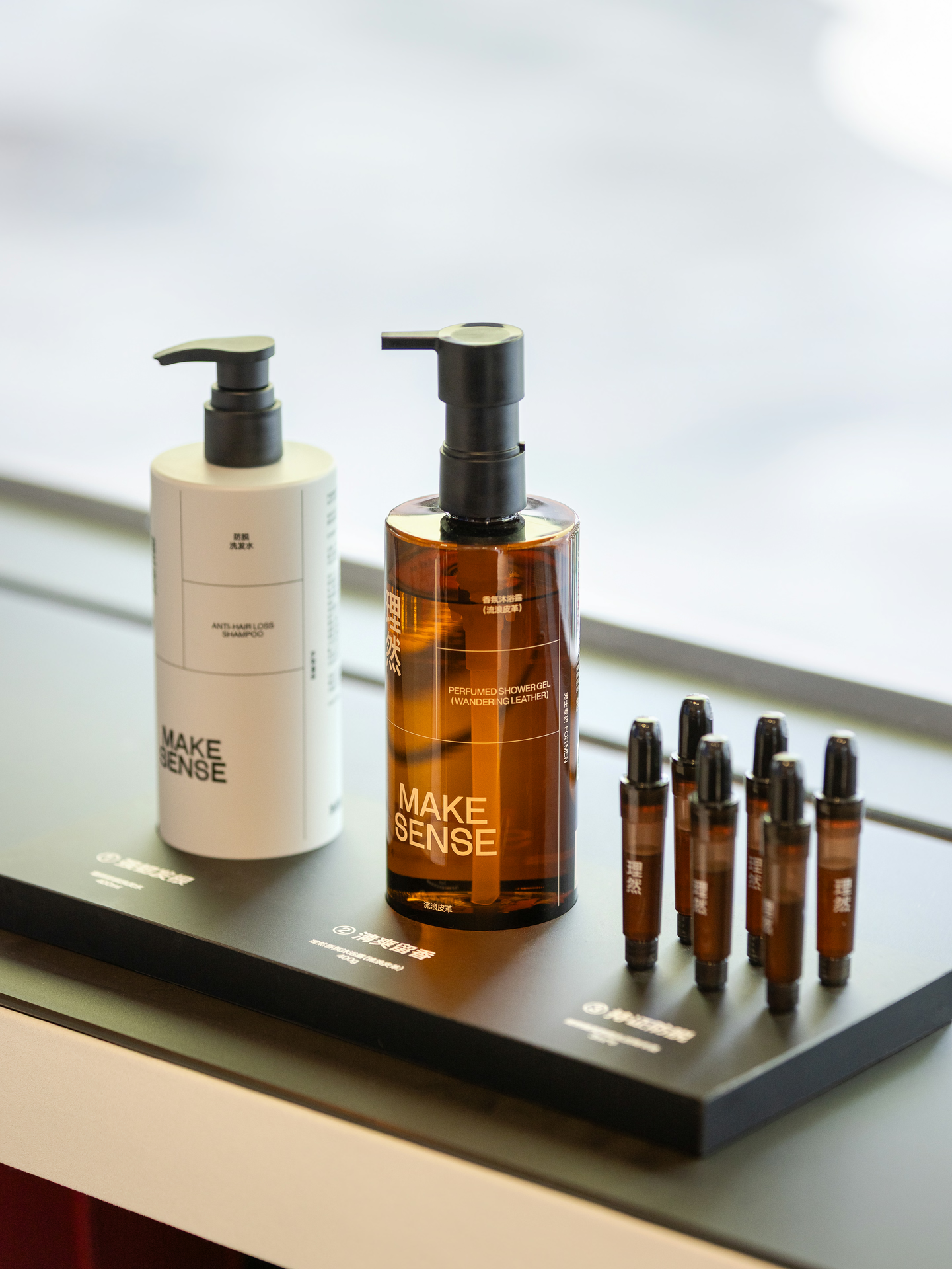
In the end, materials, colour and light express the brand's character; the link between product and scene deepens understanding of the razor; narrative interaction becomes a real, felt experience; and the space becomes a striking visual focus and a lasting memory of the brand.
Client
Make Sense
Location
Shenzhen, Guangdong
Area
64 m²
Completion Date
2025.11
Design Firm
E Studio
Lead Designer
Fan, Junjian
Zhou, Xuanzhuo
Design Team
Huang, Chenxi
Liu, Shuqi
Hu, Yulong
Fang, Guiyun
Deng, Changyi
Zhou, Jing
Su, Chunhui
Li, Bing
Liang, Limin
Photographer
WM Studio